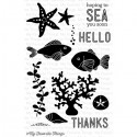
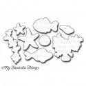
I am kicking things off with a card using Lisa Johnson's new Sea Life Die-namics and stamp set. I just love the sweet little images and simple sentiments - they make quick work of clean and simple cards!
Today I have two cards to share. Up first is this one layer card that embraces white space.
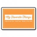
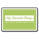
The coral was stamped with Orange Fizz Hybrid Ink. The seaweed was stamped with Sour Apple Hybrid Ink, the sand dollar was stamped with Lemon Drop Hybrid Ink, and the sea floor was stamped with Kraft Hybrid Ink. I stamped the sentiment in Black Licorice Hybrid Ink.
Everything is clustered to the upper-right and layered *just so*. I popped up the sand dollar to add some dimension.
Up next is this framed sea scene. Again, I embraced the white space and opted for a small scene and lightly colored sentiment to keep it nice and soft.
I stamped all the components on the coordinating die-cuts. I used the NEW medium Rectangle Frame and created a dimensional scene. Some pieces are flat, some are popped up, and the fish extends outside of the frame.
These products and many more will be available for purchase in just SEVEN days, on May 13 at 10 PM EST. Be sure to check out the MFT Blog to see what the rest of the team has come up with today.




Gorgeous CAS cards, so incredibly beautiful, hugs
ReplyDeletejust absolutely love your detail and layering on 2 beautiful cards.
ReplyDeleteWhat bright and pretty cards! I am loving this new stamp set!
ReplyDeleteLove both cards!
ReplyDeleteespecially love the framed scene!
ReplyDeleteLoving how you 'embraced the white space' ;) And happy to hear that you're feeling better and stamping again! Excited for this release and hoping to be back to crafting by the end of the week (after ALL OF THIS UNPACKING! Where did all this stuff come from, lol!??)
ReplyDeleteBeauteous! This is my favorite of the release! I love your cards! The coral is my favorite!
ReplyDeleteNice card samples. I'm lovin' this stamp set with coordinating dies.
ReplyDeleteSo fun!
ReplyDeleteSuch Beautiful Cards!
ReplyDeleteLove your cards! The sea Life stamp set is so cute!
ReplyDeleteTwo fantastic cards, but I must say the 2nd one is my favorite - love the raised look of the panel, so that the background really pops. Also like the white space around the scene.
ReplyDeleteBoth SO Cool! The Clean and Simple is lovely, and the 'underwater snapshot' is just darling.
ReplyDeleteAwesome cards both of them. But I love the second one with all the different levels of dimension.
ReplyDeleteLove the bright colors of the first card and how you framed the scene of the second card.
ReplyDeleteI love both of your cards! Your white space definitely allows the design elements to pack the punch!
ReplyDeleteHappy cards!!!
ReplyDelete